Choosing the right surface for cream cabinetry can feel deceptively tricky – because cream isn’t just a single uniform shade, the wrong combination can inadvertently pull out unwanted yellow tones or make a warm, welcoming space feel flat and dated.
Finding what colour worktop goes with a cream kitchen comes down to understanding your cabinet's underlying tones, working with your room's natural light, and choosing a surface material that either subtly complements or thoughtfully contrasts your units.
Why cream kitchens are hard to pair
Cream is a perennial favourite in UK homes for its inherent warmth and classic charm, but matching it with other finishes can sometimes be tricky. If you’re wondering what worktop goes with cream kitchen units – without leaving the room looking overly yellow or washed out – the journey begins by looking at your specific cabinet door finish alongside the orientation (north- or south-facing) of your room.
The undertone problem: yellow cream, grey cream, true ivory
Cream is rarely a neutral backdrop. Classic, yellow-based creams bring traditional, buttery warmth to a space, though they can easily feel overly heavy if paired with matching buttery surfaces or overly warm lighting.
Modern, grey-based creams, often described as ‘greige’, present muted tones with a cooler undertone that leans closer to off-white or light taupe.
Sitting comfortably between the two, true ivory offers a balanced, soft white with just a hint of warmth. Placing a stark, blue-toned white counter against rich yellow-cream cabinets creates a harsh, jarring clash, while pairing a deep warm beige counter with yellow-leaning units can make the entire kitchen feel uncomfortably muddy.
How north-facing and south-facing light changes cream
Natural light transforms how cabinet shades appear throughout the day. North-facing kitchens receive cool, bluish light that can render light cream units slightly flat or exaggerate underlying grey tones. In these spaces, warm or mid-toned worktops are essential to inject welcoming energy back into the room.
South-facing kitchens, by contrast, are bathed in strong, warm sunlight that naturally amplifies yellow undertones. In these brighter environments, cooler worktop undertones, crisp warm whites, or dark grounding surfaces bring a harmonious balance to the space.
The five worktop colours that work with cream units
When exploring cream kitchen units, what colour worktop will achieve the most elegant balance? These five surface palettes deliver striking, timeless results across both classic shaker and sleek handleless designs.
Warm white
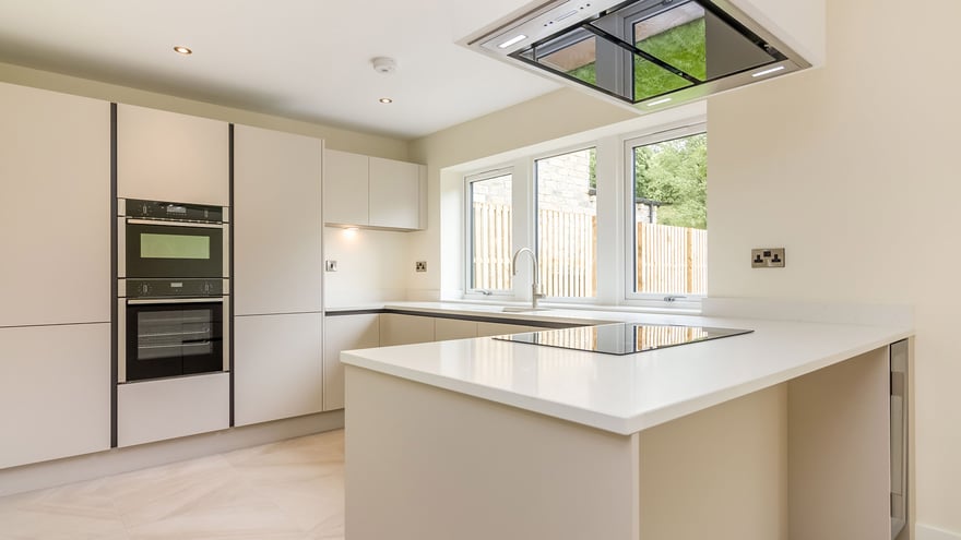 Case Study: A new luxury development in the Yorkshire countryside
While a stark, clinical white can create an unforgiving contrast, warm white worktops connect effortlessly with cream cabinetry. Designs such as 4600 Organic White feature soft tonal flecks that gently bridge the gap between bright white and creamy undertones. For a touch of understated elegance, 5151 Empira White offers a delicate marble-inspired design set against a soft white backdrop, elevating traditional cabinetry without feeling stark.
Soft grey
Soft grey introduces a gentle, low-contrast transition that subtly modernises cream doors without overpowering them. A design like 5000 London Grey showcases delicate charcoal veining resting on an opaque light grey base, softly cooling buttery cabinet tones while keeping a quiet, classic feel throughout the kitchen.
Black and near black
A dark surface anchors lighter cabinetry, creating a sophisticated contrast that feels both dramatic and refined. Options like 5810 Black Tempal provide a soft-black, tactile finish layered with hazy mineral details that keep dark surfaces feeling organic rather than harsh. For a more traditional, high-contrast look, 5100 Vanilla Noir features a rich black base swept with delicate vanilla veins that pick up the warmth of your cabinetry.
Warm stone, taupe, and rich neutrals
Moving beyond flat taupe gives your kitchen a layered, multi-dimensional feel. Designs like 5212 Taj Royale, 8252 Sedara, and 550 Silvax present soft cream-beige backgrounds with varying veining and detailing, offering organic elegance that feels rich yet light.
 Case Study: A family-friendly kitchen with timeless appeal using 4023 Topus Concrete (Photography by Chris Snook Photography)
If you prefer a moodier aesthetic, 4401 Organic Dusk serves as a warm, earthy alternative to standard charcoal or black, adding grounding contrast and preserving a cosy atmosphere alongside creamy units.
Marble effect with warm veining
Marble-effect surfaces introduce an enduring elegance to the kitchen without competing against cream tones. For bold, luxurious drama, 5131 Calacatta Nuvo makes an unmistakable statement with sweeping grey veining flowing across a creamy white base.
For a similar aesthetic across different design budgets, 5116 Calacatta Nectar weaves warm golden and honeyed grey veins into a radiant surface, while 5113 Solenna uses subtle amber and putty-grey lines to tie seamlessly into warm cabinetry.
 Case Study: Traditional meets contemporary in this London family kitchen
What colour walls go with cream kitchen units?
When considering what colour goes with cream kitchen units, wall paint plays a central role in framing the whole scheme. A common pitfall is matching paint directly to the cabinet doors, which often washes out the space.
Pair the wall to the worktop, not the units
To keep your kitchen design visually balanced, take your cues from the secondary tones found in your worktop rather than trying to match the doors. If your chosen surface contains subtle grey, taupe, or soft charcoal accents, choose a paint colour with matching undertones to pair your horizontal and vertical surfaces seamlessly.
Three tested wall and worktop combinations
If you’re deciding what colour to paint your kitchen with cream units, specific pairings unfailingly deliver an inviting atmosphere.
- Yellow-cream cabinets paired with a warm white surface like 4600 Organic White sit beautifully alongside soft muted sage or gentle off-white paint.
- Ivory or greige units combined with a warm neutral like 8252 Sedara pair effortlessly with warm stone or greige wall shades.
- For classic cream cabinets paired with dark charcoal surfaces like 5810 Black Tempal, pale warm grey or rich warm ivory walls provide an elegant frame.
When finalising your wall colour, always review paint swatches directly alongside cabinet and worktop samples under your home’s lighting, and at different times of day.
Cream units with a black worktop: keeping it warm
Combining cream cabinetry with a dark worktop creates a striking feature, but achieving balance here comes down to styling. If you’re asking what colour walls work best with a cream kitchen and black worktop, step away from bright pure white paint, which can feel harsh against creamy doors. Opt instead for soft off-whites, warm muted greys or gentle pastel tones. Introducing warm timber flooring or brushed brass hardware naturally softens the contrast, keeping the overall scheme warm and inviting.
For contemporary kitchens featuring a high-gloss finish, consider what colour worktops work best with cream gloss kitchen schemes. Tactile dark surfaces like 514 Emprada or deep veined finishes like 5100 Vanilla Noir absorb light gracefully, balancing the high reflectivity of glossy doors.
Tiles and splashback choices for a cream kitchen
Choosing what colour tiles work with cream kitchen units depends on whether you want your splashback to act as a quiet backdrop or a refined feature. Continuing your chosen worktop directly up the wall as a full-height stone splashback creates a clean, architectural look that opens up smaller kitchens. Alternatively, handcrafted Zellige tiles (Moroccan clay tiles) featuring slight tonal variations in soft white, cream, or warm grey introduce a subtle texture. For a gentle splash of colour, muted greens, warm terracottas, or soft blue-greys bring individuality to neutral cream spaces while preserving warmth.
Three cream schemes to inspire
To help you design your new cream kitchen, here are three easy-to-implement cream schemes.
Cream, warm white worktop, brass
Classic ivory cream units pair effortlessly with a 4600 Organic White worktop to create a bright, timeless foundation. Complete the look with brushed brass handles, aged brass tapware, pale oak flooring, and soft off-white walls for a warm, elevated aesthetic.
 Case Study: Garden-Facing Galley Kitchen Renovation (Photography by Chris Pugh Photography)
Cream, black worktop, oak floor
Warm cream cabinetry paired with a dark 5810 Black Tempal worktop brings tactile depth and rich contrast. Frame this striking pair with light, warm-toned plaster grey walls, medium oak flooring, and matte black or iron fittings for a sophisticated finish.
Cream, taupe worktop, sage walls
Muted greige cream doors set against an earthy surface, such as 4201 Organic Dune, create a calm, organic mood. Layering gentle sage green paint on the walls alongside neutral ceramic tiles and natural timber elements brings a serene, nature-inspired feel to the heart of the home.
Order your samples today
Because natural light and cabinet undertones vary in every home, testing finishes in your own environment is essential. To find your ideal combination, order Caesarstone samples today to compare them directly with your cabinet doors, or use our interactive visualizer tool to see them in your kitchen as you bring your design vision to life.