Introducing contrasting cabinetry into your kitchen isn’t just a trend; it’s a design technique that brings depth, balance and personality to your space. By pairing light and dark tones, or mixing bold hues with softer shades, you can create a dynamic visual impact that highlights your kitchen’s best features.
Creating depth and character through contrast
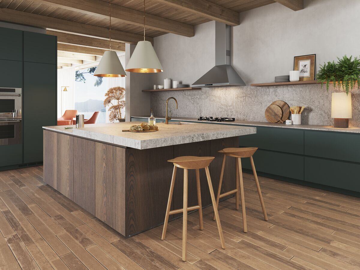
Contrast isn’t just about choosing two opposing colours; it’s about creating depth and a visual dialogue. Dark lower cabinets in charcoal or deep navy ground the room, lending a sense of solidity and luxury underfoot. Above, lighter shades like ivory, dove grey or even a soft pastel draw the eye upward, making the ceiling feel higher and the space airier.
If you prefer a more daring or stark approach, consider the timeless approach of black and white. Matt black lowers with crisp white uppers create a gallery-like backdrop for your space. Or, try pairing a warm, earthy terracotta base with muted sage uppers to evoke a modern Mediterranean mood that’s rich with character and warmth.

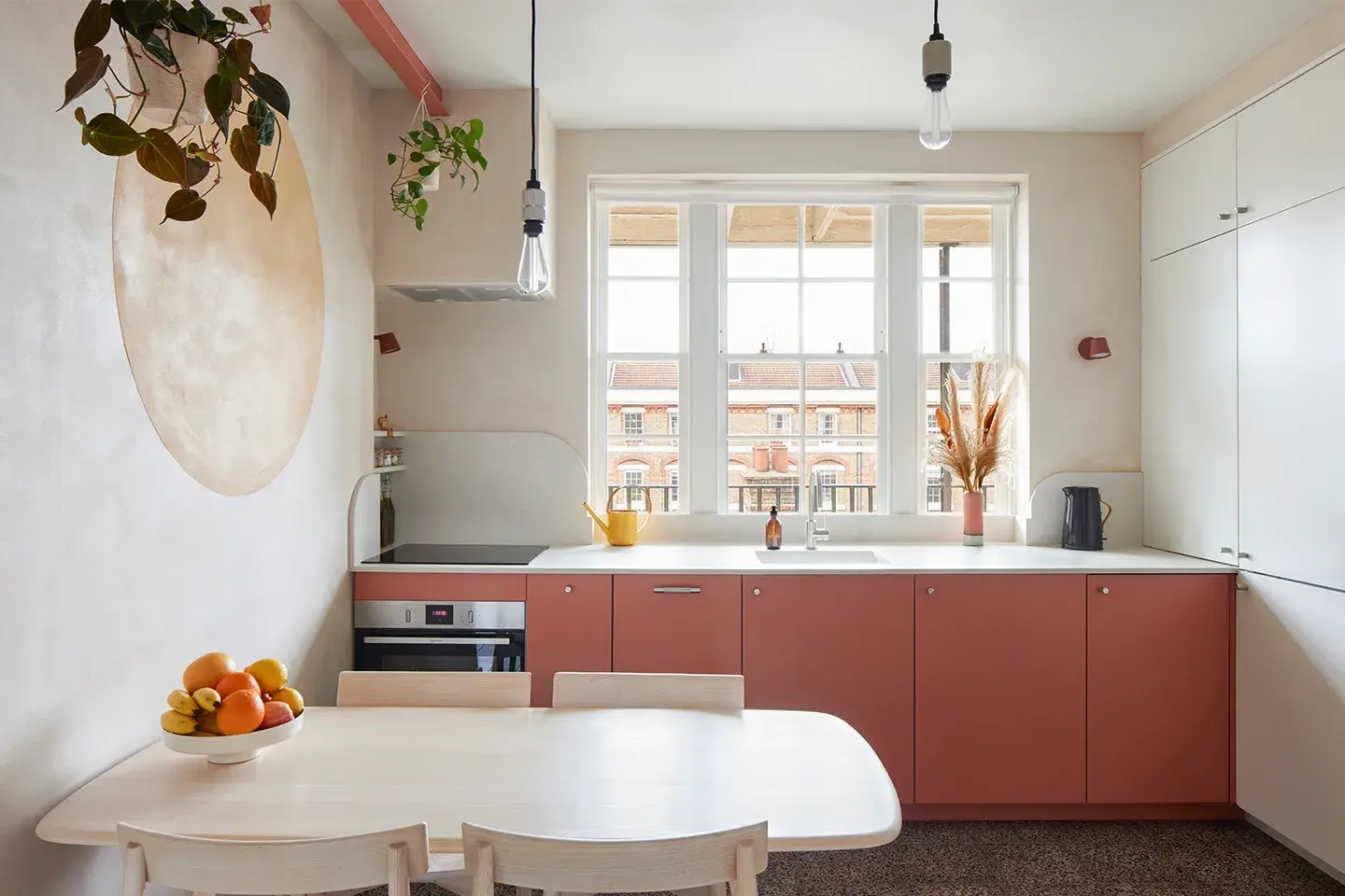
This urban kitchen paired soft terracotta lowers with white uppers and neutral walls for a pared-back Mediterranean feel, completed with 4011 Cloudburst Concrete.
Complementing your worktops
Choosing contrasting cabinetry presents an opportunity to showcase your Caesarstone worktops as the focal point. Our surfaces are available in a range of colours and textures, so you’ll be able to find the perfect one to either harmonise or dramatise your cabinet choices.
If your lower units are dark, a light-coloured worktop like 5140 Dreamy Carrara or 504 Lumena will enhance brightness and lend a refined, marble-inspired elegance. The subtle veining and polished finish will catch the light, drawing attention to the craftsmanship. Alternatively, if you’d prefer to lean into a darker, moodier vibe, consider a richer countertop like 544 Auralux, 5101 Empira Black or 511 Smokestone. The engineered resilience of Caesarstone means that even in high-traffic kitchens, your contrasting design will remain striking for years to come.
Expressing your style
Ultimately, your choice of contrasting cabinetry should reflect your personal aesthetic.
For minimalists, a combination of soft grey and pure white offers a serene, spa-like ambience. This colour palette accentuates clean lines and lets your worktop sing. Pairing these tones with gentle worktops like 5310 Brillianza or 4001 Fresh Concrete keeps the room calm and cohesive while mixing a few different hues.

The owners of this London kitchen paired 4601 Frozen Terra with sky blue lowers and oak uppers.
For those with a penchant for maximalism, pair jewel-toned lowers (think emerald or sapphire) with more neutral uppers in warm taupe or cream. The rich base brings drama, while the subdued uppers balance the scheme and stop it from becoming too heavy on the eye. Here, a bolder Caesarstone pattern, such as 5171 Arabetto or 6313 Turbine Grey, can add another layer of interest.
Even in transitional or eclectic kitchens, contrasting cabinetry can bring together disparate elements. For instance, if you have reclaimed timber open shelving or vintage accents, balance their organic texture with sleek lower units in a complementary tone.

This family kitchen combined dark grey lowers with light wooden uppers and 4044 Airy Concrete to create an open space that feels both uplifting and grounded.
Finishing touches
Once your colour palette and worktop have been chosen, the finishing touches make sure your whole kitchen design works together.
Lighting plays an important role; strategically positioned downlights will not only showcase your Caesarstone worktop but also emphasise the contrast between your cabinets. Hardware is your next opportunity: brushed brass or matte black handles can accentuate deeper cabinet tones, while polished nickel or chrome on lighter doors brings a touch of sparkle.
You can have fun with your kitchen accessories too, to balance the contrasting colours or to tip the scales one way or the other. Matching your various accessories, like tea towels, your kettle, any display pieces, plant pots, etc., to your upper and/or lower cupboards is a great way to play with your colour palette.
Backsplash choices should either echo your worktop for a seamless look or introduce a subtle accent. A tone-on-tone textured tile can break up expanses of cabinetry without distracting from the overall contrast, or continue your worktop up the wall with a backsplash made from the same material. Meanwhile, open shelving offers a chance to display curated objects (artisan ceramics, brass accessories or green herbs) that pick up to your cabinet colours, creating a fluid visual narrative.
Creating contrasts with Caesarstone
By thoughtfully combining contrasting cabinetry with complementary Caesarstone worktops and polished details, you can craft a kitchen that is both vibrant and elegant. To help you find the perfect worktop for your colour-contrasting kitchen, request one of our samples to visualise a Caesarstone worktop in your home, or visit one of our studios to see a huge range of large-scale worktops in person.
.jpg)