Colour palette has a huge impact on an overall scheme. Whether the overriding statement of the room or subtle accent within, the tints and tones that comprise a design can alter the overall dynamic. For a look into the basics of colour psychology and a more in-depth assessment of the colour wheel, read our Insider Guide to Kitchen Colour. For a quick read, here are the key palettes that will never fail to achieve a stylish look and some ideas on which worktops they are best paired with:
Monochrome
Monochrome is a timeless design that suits many styles of kitchen. Striking black cabinets can be completed with pure black worktops to create a bold, uniform scheme. Or you could opt for sheer contrasts that feel effortlessly modern, white cabinets paired with black worktops such as 5100 Vanilla Noir (or vice versa, interchange to opt for a charcoal cabinet with a bright white surface like 6011 Intense White) for a sophisticated monochrome look.
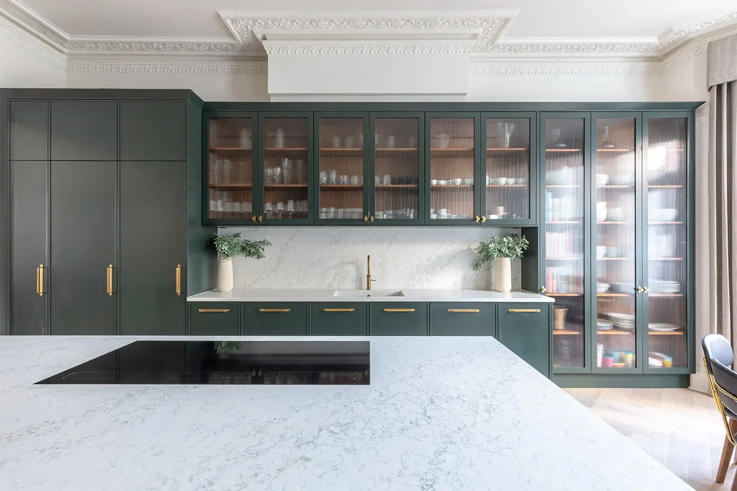
Rich jewel colours
The luxurious jewel-toned colour palette continues to dominate interior trends for 2020, enhancing and bringing a new lease of life to traditional, elegant schemes. This look is particularly striking when pairing opulent coloured cabinets with a contrasting statement black or white marble worktop, which bring their own innate beauty while allowing the cabinetry colours to shine.
Grey
Grey is undoubtedly the colour of the moment, having overtaken white and cream to become the most sought after base colour. Wholeheartedly embrace the look by layering grey on grey for a sophisticated and on-trend look, or utilise it as a simple base colour with colour-pop accessories. This palette works equally well in a traditional country kitchen as it does in a sleek contemporary design. The versatility of worktop materials offered within this colour choice range from tactile concretes like 4033 Rugged Concrete to luxurious marbles, like 5043 Montblanc.

Pretty pastels
Pastel tones offer a fresh base that brings an added depth and interest to a neutral colour palette, perfect for creating a sense of light and space. These soft, delicate colours work well with a luxurious marble worktop (such as 5031 Statuario Maximus), but can also be topped with beige for added warmth (like the effortlessly chic 6131 Bianco Drift).
/Kitchen%20Worktop%20in%205031%20Statuario%20Maxima.jpg?width=600&name=Kitchen%20Worktop%20in%205031%20Statuario%20Maxima.jpg)
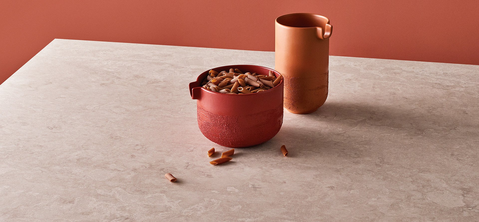
Retro palette
With vibrant peach, teal, burnt orange, mustard and moss green hues making a resurgence, give your kitchen a colourful makeover with an Orla Kiely-inspired twist. Enhance this look with a simple grey worktop (such as 4003 Sleek Concrete) that works especially well with the muted tones of this retro colour palette that’s become popular in recent years.
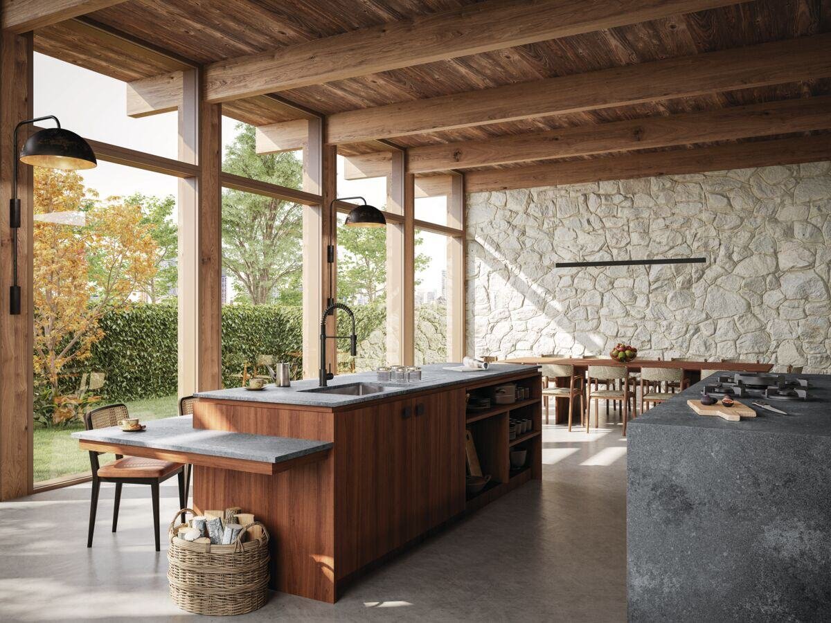
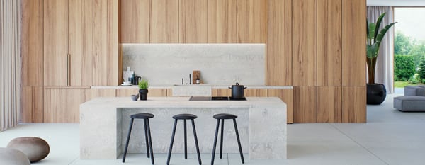
Neutrals
You can’t fail to achieve a classic design with a neutral colour palette, which works perfectly in most schemes, but particularly a Scandinavian design. Combine stripped back wood with a simplistic grey worktop such as 4044 Airy Concrete, or 4043 Primordia can add a unique element of warmth and texture without overpowering the design.
Looking for advice on how best to preserve your quartz worktop, along with which cleaning products to use and avoid? Download ‘A guide to caring for quartz’.

Images Source: Caesarstone