The kitchen is often seen as the heart of the home – it’s where meals are cooked, memories are made and laughter fills the air. So, it's no surprise that you want a kitchen that not only functions well but also feels inviting and inspiring. And one of the biggest factors that affects a kitchen's atmosphere? Colour!
Choosing the right colour scheme for your kitchen can feel overwhelming, but don’t fret! This guide will equip you with the knowledge to create a harmonious and visually pleasing space.
Considering the big picture
Before diving into specific colours, take a step back and consider the overall feel you want to achieve. Do you envision a bright and airy space, or a warm and cosy one? Here are some factors to ponder:
Natural light
Some kitchens are blessed with abundant natural light through large windows, conservatories or big patio/bi-fold doors – these light kitchens can handle bolder, brighter colours. On the other hand, kitchens with less light might benefit from lighter colours that enhance brightness and help make the room feel more spacious.
Kitchen size
There are some key things to remember when it comes to kitchen size. For example, dark colours can visually shrink a space, so use them sparingly in small kitchens. This can be ideal if you’re trying to create a cosy space in a bigger kitchen. In comparison, lighter colours create a sense of openness and feel much more inviting.
Kitchen style
If you choose a modern kitchen, they will often use sleek colour palettes with whites, greys or blacks, as well as a more glossy feel to the kitchen cabinetry. Traditional kitchens might incorporate warmer tones like creams and beiges with natural wood finishes in a more traditional shaker or matt-style kitchen cabinet.
The colour coordination trio
It's important to remember that there are three main colour components of your kitchen: worktops, cabinets and paint.
Worktops
Worktops should be both beautiful and functional, and it’s a good idea to consider choosing a worktop before any other colour element in your kitchen. No matter whether you’re choosing a quartz, porcelain or mineral worktop, there are many colour choices available, to go with whichever style you’re going for.
Light-coloured worktops (white, beige or light grey) such as 5140 Dreamy Carrara or 4001 Fresh Concrete create a clean, warm and bright look. Alternatively, dark kitchen worktops (black, brown or dark grey) such as 5003 Piatra Grey and 302 Metallio Black add a sense of drama and striking alternatives to lighter colours.
 Case Study: A classic Regency kitchen with a contemporary twist
Consider contrasting your kitchen worktop with your new cabinets – light cabinets with dark worktops, or vice versa to create a striking look. For example, pairing the 5171 Arabetto worktop with Farrow & Ball’s Studio Green on your cabinetry; the deep colour of the cabinets perfectly contrasts with the brightness of the worktop as seen in this classic Regency kitchen with a contemporary twist.
 Case Study: Private Home, Surrey
Alternatively, the 5031 Statuario Maximus worktop pairs wonderfully with Farrow & Ball’s Railings thanks to its billowing grey veins and soft white base contrasting the dark cabinets in this private home in Surrey.
Cabinets
Kitchen cabinets are often a focal point in the kitchen due to their large surface area, so their colour can be used to set the tone. Popular choices include white cabinets for their timeless and bright look, grey for a more modern essence with sophistication, and wood tones for a warm and inviting look.
These colours are popular for a reason but don’t write off introducing some different colours into your kitchen. For example, blue kitchens are versatile and a captivating choice as they evoke a sense of calm while simultaneously making a bold statement. Another alternative is a black kitchen, this darker option adds a different tone to your home as well as an element of finesse and luxury, transforming your kitchen into a showstopper.
Paint and tiles
One of the final colour choices made for any kitchen is the wall paint and kitchen tiles. They can be used as a way to complement your new kitchen design and bring alternative colours into the space. Lighter colours like white, cream, pale blues or pale greens open up the space. Bold accent walls can add personality, but use them strategically as you don’t want to overpower your other colours.
For kitchen tiles, don’t forget that patterned tiles can add a splash of colour and unique design to your space. This can also be achieved by combining plainer tiles with more intricate patterns such as with a herringbone pattern, diamond shapes or a basket weave style.
Choosing a colour palette
Choosing a specific colour palette is a great way to personalise your kitchen. Here's a breakdown of how each category can influence your space:
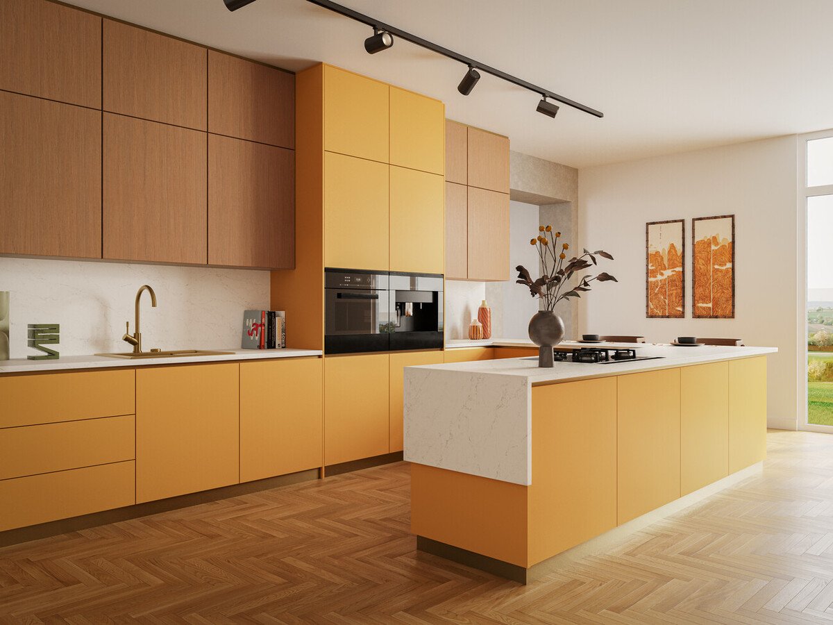
Whites
Timeless and elegant, white and natural coloured kitchens create a bright and airy feel, perfect for any home and style, from modern to traditional. These lighter colours can make small kitchens appear larger and more welcoming. Colours such as crisp white, off-white (cream), marbles and antique white are all fantastic choices.
.png?width=750&height=434&name=Untitled%20design%20(7).png)
Remember that a purely white kitchen can look slightly sterile so balance it out with warmer tones or pops of colours with wall paint, accessories or a backsplash. Also, consider introducing natural wood tones and stainless steel appliances to finish off the look. For example, 5121 Layalite is a snow-white worktop with soft grey and ochre veins. Because of the tiny amounts of mustard yellow in the vein, it pairs well with Farrow & Ball colours such as Dorset Cream, a rich yellow tinted cream, and Sudbury Yellow, a mid-tone yellow. Layalite can also be comfortably complemented by light greys with blue-green pigments in them such as Skylight, Pale Powder and Light Blue being the best matches from Farrow & Ball.
Our collection of white marble designs includes on-trend and heavily veined styles, characteristic of 506 Mirabel and 5171 Arabetto, which meet the desire for bolder aesthetics in homes. New additions 5113 Solenna and 5140 Dreamy Carrara feature striking cascading vein details that offer new interpretations of this luxurious style. For more pure whites, 110 Whitenna and 2141 Snow offer a clean and refreshing white canvas, perfect for pairing with any cabinetry.
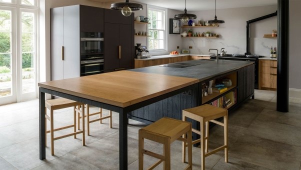
Darks
Darker kitchens can bring a dramatic and sophisticated feel to your space, and are ideal for large, well-lit kitchens, either with lots of natural light or carefully considered artificial lighting. Choosing this moodier colour palette can also bring a stark difference to other bright colours around your home to create a softer mood in your kitchen. A black kitchen is the perfect example of a darker kitchen but there are other colours to consider such as deep navy blue, charcoal grey or hunter green.
.png?width=750&height=434&name=Untitled%20design%20(8).png)
When designing a dark kitchen, be aware that it can make a small kitchen feel closed in, or even gloomy. To combat this, pair it with lighter-coloured walls, metallic accents such as brass or copper (like in your door handles or light fixtures), and add light wood tones in other accessories for warmth. For example, 5100 Vanilla Noir matches perfectly with Joa’s White, a warm yet light neutral, and Tanners Brown, an almost black brown. Both Farrow & Ball colours are natural matches due to the brown and red undertones present in their formulas. Using these three in a scheme together, regardless of proportions, will result in a beautiful aesthetic that will feel timeless and elegant.
At Caesarstone, we have a fantastic range of darker colour worktops to suit your space. 5101 Empira Black and 511 Smokestone each show the imaginative ways in which darker base tones can be beautified by contrasting lighter veining, creating a rich canvas of dramatic contrast. On the other hand, 5810 Black Tempal and 5820 Darcrest showcase complex compositions of mineral-like layers with patterns of gentle erosion that create intricate designs with unique tactility.
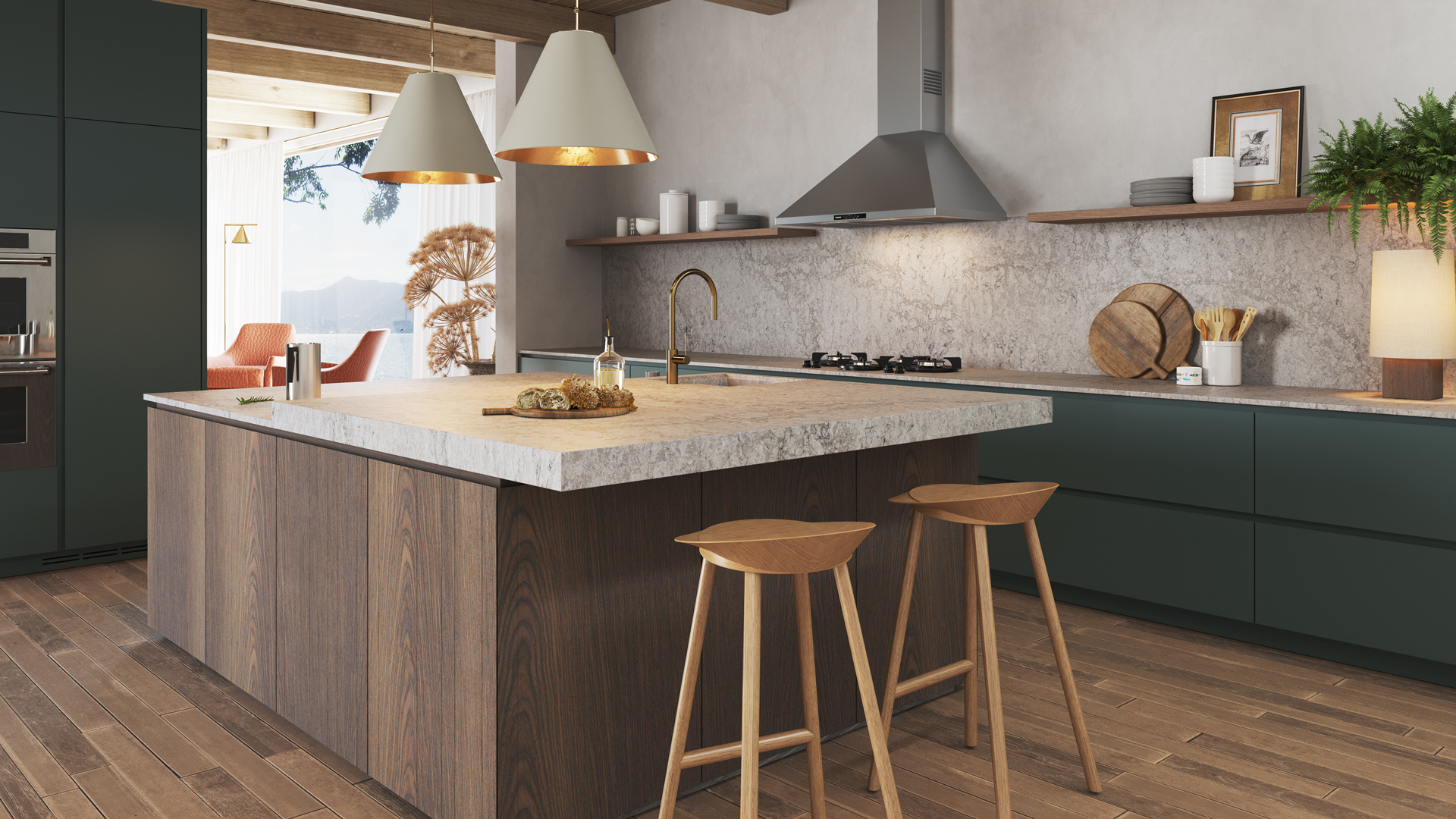
Earthy tones
Choosing more earthy tones for your kitchen can transform it into a warm and inviting space by creating a sense of connection to nature. Colours such as light grey, sage green, terracotta, warm beige and light brown are perfect for rustic, farmhouse, or Mediterranean styles. Depending on how dark an earthy tone you choose, it may feel a little dark in a smaller kitchen with limited natural light.
.png?width=750&height=432&name=Untitled%20design%20(9).png)
Consider pairing your new earthy palette with lighter shades of the same colour family, as well as white accents, and natural wood or stone elements to help bring your design together. For example, 4023 Topus Concrete is a beige concrete-style worktop that is best suited for tonal colour schemes where it’ll be enhanced most by warm, earthy colours. Farrow and Ball offer a number of perfect pairings such as off-whites like the Great White or neutrals with red undertones such as Dove Tale, a light greige, Charleston Gray, a light brown and London Clay, a slightly darker brown.
All of our Caesarstone worktops are designed to look beautiful for a lifetime and offer a perfect foundation for any homeowners seeking to evoke a more organic and sustainable approach to interior living. Utterly timeless, beige surfaces such as 412 Beige Ciment and 5212 Taj Royale are the perfect alternatives to crisp white. Light enough to make a space feel bright and airy, they also promise to bring a serene and calm feel to a kitchen thanks to their soft, organic hues and gentle motifs. As the trend for authentic and raw materials shows no signs of slowing down, greige tones, including 6046 Moorland Fog and 513 Striata in particular, continue to draw attention.
Our tips for colour harmony
When choosing your next kitchen colour, there are a few rules we believe you should consider to create a harmonious and well-connected space.
The rule of three: Limit your colour palette to three main colours. This creates a cohesive look and avoids overwhelming the eye.
The colour wheel: Use the colour wheel to find complementary colours that sit opposite each other such as blue and orange or yellow and purple. These can create a vibrant and energetic atmosphere.
Sample, sample, sample: Before committing, paint swatches on your walls, order worktop samples, and order cabinet door samples. See how the colours interact with your lighting and existing elements as things can look different online or in a showroom than they do in your space.
Don't forget the details: Appliances, flooring, wall decorations and other accessories (such as seating or plants) also contribute to the overall look. Consider how their colours will complement your chosen colour scheme.
Ready to create your dream kitchen?
No matter which colour palette you choose, we hope you now feel fuelled with inspiration to style your dream kitchen. To help you decide on the perfect worktop for your space, request a sample from Caesarstone to visualise it in your home.