Colour contrasts are popular within interior design. There is science behind the visual satisfaction gained from two colours sat at opposite ends of the colour spectrum from one another, which share a synergy to complement and enhance one another. Utilise this method in your scheme for a highly successful design.
Choosing your colour palettes
Monochrome is a long standing favourite within kitchen design. It is effortlessly chic and a prime example of why juxtaposing colours work so well. They speak a shared visual language; a common aesthetic in contrasting tones of light and shade.
.jpg?width=600&name=5101_Empira_Black_Full_Slab_GLOSS%20(1).jpg)
Equally, vibrant colours are being further embraced and offset with lighter tones which both offset and showcase the boldness of the palette. Our Insider Guide to Kitchen Colour is a helpful resource for finding the best colour scheme for you.
Implementing within a kitchen design
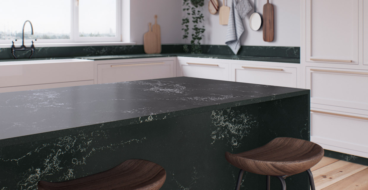
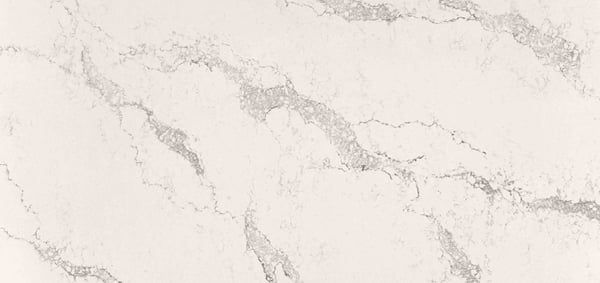
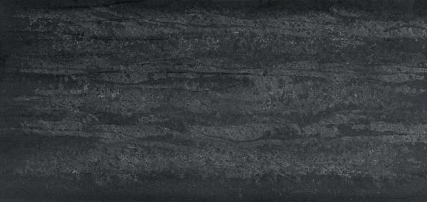
There are several effective ways to display these colour contrasts within your kitchen, first of which is juxtaposing the cabinets and worktop. A sleek black surface atop a simple white cupboard (and vice versa) achieves a timeless look. Material choices can make this as effective in a modern space as in a traditional one. For example the matte infinity of a deep inky surface would suit a contemporary kitchen, whereas a delicately veined black marble one would offset a classic design. The same logic can be applied with a coloured cabinet and a white surface, for example.

Another successful variation is to contrast the top and bottom cupboards. This is often applied when using a vast amount of cabinetry to maximise storage, but helps blend the top section into the walls to prevent the kitchen itself becoming too dominating. The upper level is cleverly disguised, whilst allowing for the colour contrasts between lower cabinets and walls to become the feature.
The final option is that of a statement island. By nature, an island is the focal point of the space, so capitalise on this as an opportunity for a design feature. Make the centrepiece special by showcasing your beloved worktop to its deserved best with a waterfall end. Or create a colour block with a splash of an alternate shade on the island cabinetry.

These colour contrasts can be taken a step further by taking material and textural properties into consideration also. These add another layer into the sensory experience offered, offering another dimension to the overall scheme. A rustic, bare wood cabinet can be offset effectively with another raw material such as concrete or stone. Choosing a deep enough shade will be pivotal in the success of such a design, allowing for the materials to simultaneously complement and offset one another.

Choosing the right worktop will be a critical element in the success of your contrasting scheme. See our collections at one of our studios to view as full slabs, enabling you to take in the scale of their beauty and find the best colour for your design. Book an appointment to find your favourite…
Images source: Caesarstone
