A young professional couple commissioned Kitchens & More to design a modern kitchen as part of the extension project of their Victorian-terraced home in Fulham, West London, complete with Caesarstone quartz worktops.
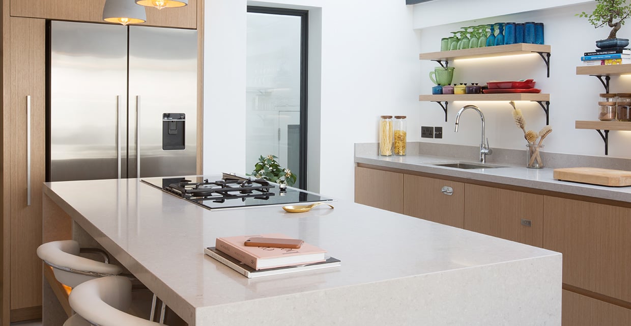 Hannah and Toby Baker who had purchased their first home in London, wished for a large bright open plan kitchen and a dining space that could be easily used for both entertaining guests and socializing as well as for day to day cooking.
Kitchens & More, a Chelsea-based boutique studio renowned for their expertise in the latest technology of bespoke cabinetry systems, proposed a clutter-free design solution that resonated immediately with the home-owners’ modern lifestyle and refined minimalist taste.
The starting point was the layout of the kitchen units within the rectangular floorplan. The choice of one wall and central island unit allowed easy flow and access around the entire kitchen area as well as the rest of the space in the extension unit. Kitchens & More’s proposed design solution for storage and cabinetry allowed minimal usage of the actual worktop surfaces, making these the core feature of the kitchen.
Hannah commented of the island: "We love the island, as it allows us to cook facing forward and every details has been thought through".
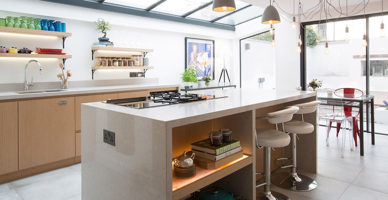 Rooflights positioned right above the space meant significant amount of natural daylight flowing into the room, granting the home-owners more freedom in their choice of colour (usage of darker tonalities in smaller kitchens can often visually end up shrinking the space), without compromising the overall spacious look and feel of their modern design.
The Baker family had a very clear colour palette in mind for the kitchen, and brought a suggestion for the floor tiles to Kitchen & More’s director, Elcio Betta.
Caesarstone’s Clamshell was an obvious choice to match with the couple’s preferred tile colour, as Elcio explained: “Caesarstone has the most beautiful collection of quartz colours, and when I was asked to offer a complementing colour that would work with the client’s choice of tiling, Caesarstone’s Clamshell immediately came to mind.”
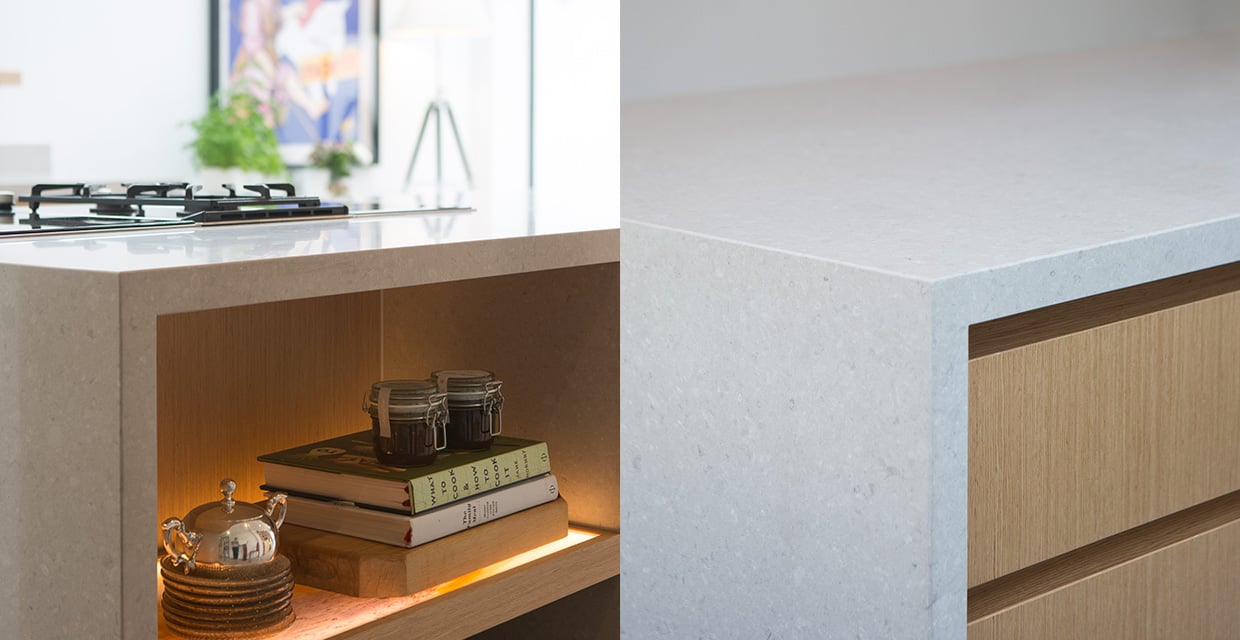
The choice of the Clamshell quartz, a design consisting of a soft fusion of light grey tones with subtle white features, was an inspired choice that won approval from the family, said Elcio.
“When I showed the Clamshell sample to the client, she was delighted. ‘This is it,’ she said. I didn’t have to show her any alternatives.”
Hannah was also a fan of the durability of the quartz worktops: "The finish is very clean looking, stronger than stone, easy to maintain and resistant to scratches and stains."
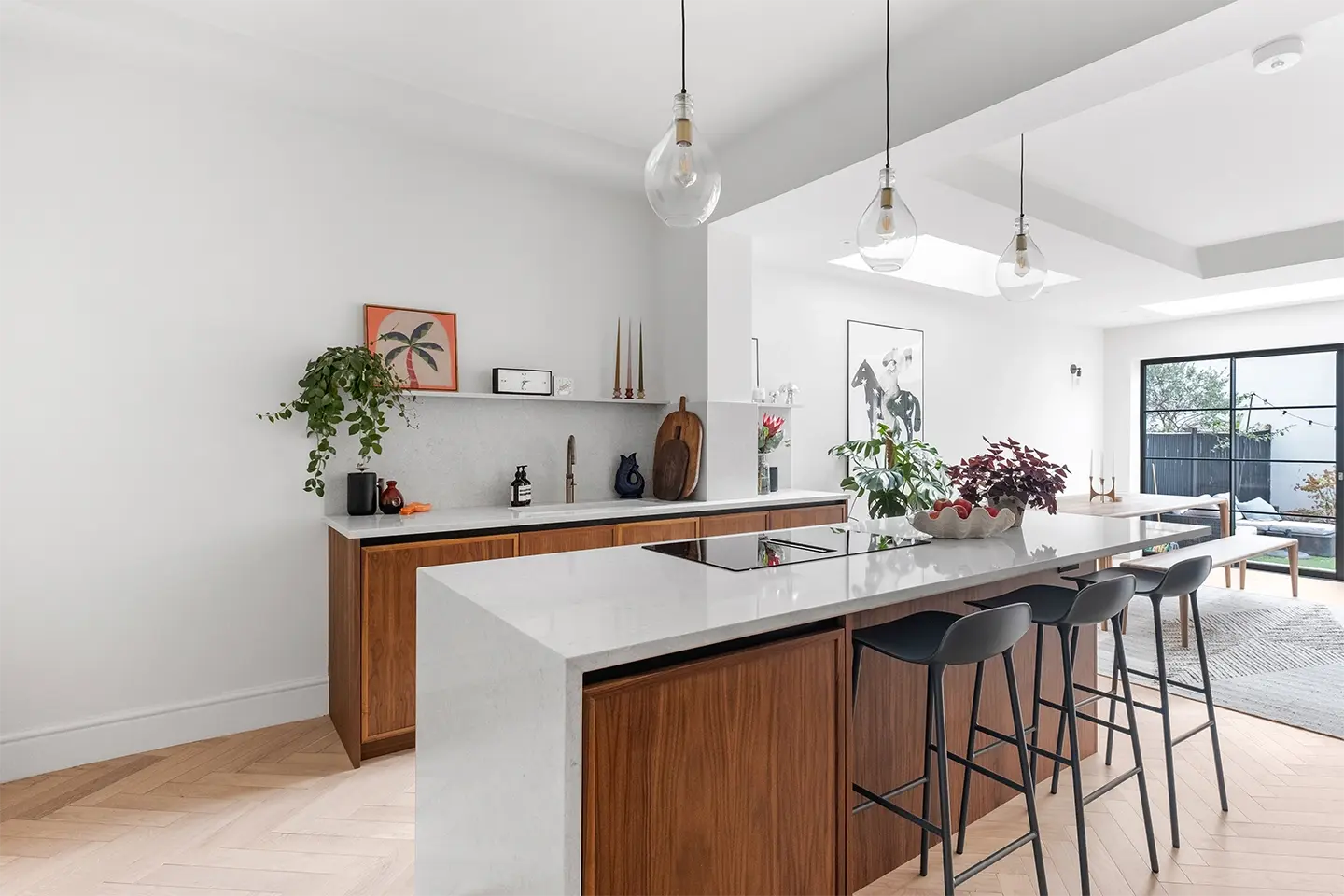
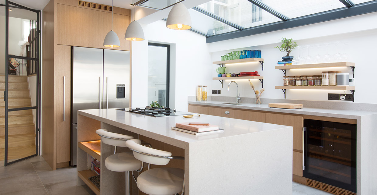
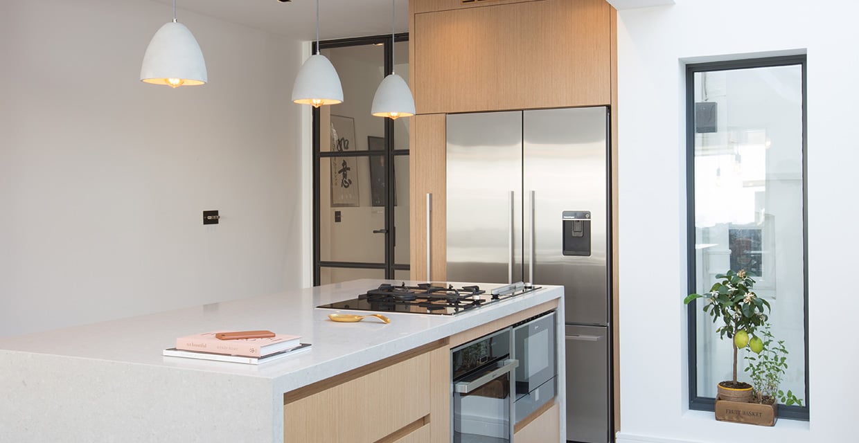
 Kitchen & More’s design for the scheme included the design of bespoke cabinetry based on the studio’s exclusive wood veneer collection, which included a full extra-wide waterfall edged island, also finished in Clamshell, for a dramatic statement. On one length the island features integrated handle-less storage, and two top of the range ovens from Neff, whilst the reverse of the island includes shelving with feature lighting and a large open recess within the island so that it can be used as a breakfast bar, with complementing kitchen stools.
 As Caesarstone’s quartz surfaces are water-stain resistant and non-porous, Kitchen & More also saw an opportunity to declutter the area around the Blanco sink with cleverly laid drainage grooves that prevents sitting spilt water without the need for further hardware, and offers a clean, minimalist aesthetic.
The look was enhanced with matching Clamshell quartz splashbacks surrounding the walls above the base units. On the walls themselves, Kitchens & More used the same veneer finish from the cabinetry for the kitchen’s shelving, a careful consideration of the details that unifies the design, with gentle under shelf lighting that prevents the walls from being cast in shadow.
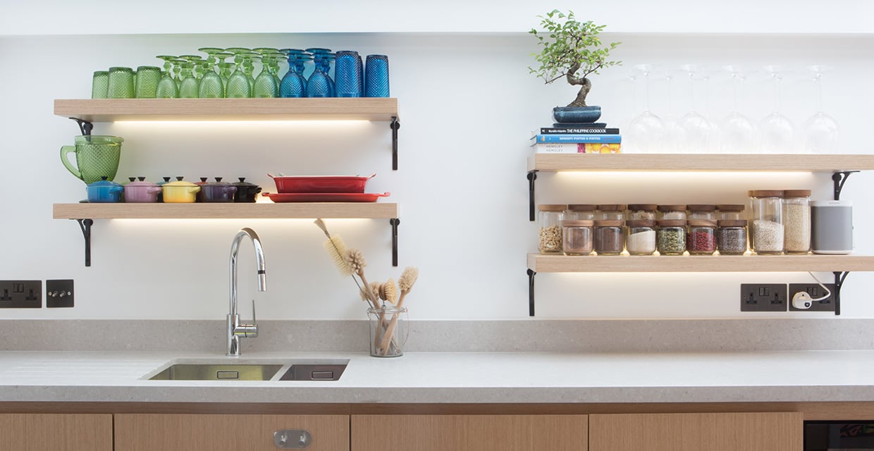 The effect of the under-shelf lighting and the careful pendant luminaires above the island, in combination with the large amount of natural daylight, offers a wonderfully fresh and bright appeal to the kitchen, and helps broaden the room, creating a sense of depth and space within.
The complete design from Kitchen & More demonstrates how the combination of contemporary furniture and gorgeous colour combinations for worktops, cabinetry and flooring can create a gorgeous focal point for the home, ideal for dining, cooking or entertaining. Hannah's closing comments summarised the positive results of Kitchen & More's considered design: "We love our new kitchen. It's really given us everything we asked for".
 Category: Home Renovation
Designer: Kitchens & More
Location: Fulham, South West London
Project: New kitchen as part of an extension project
Property Type: Victorian-terraced
Product: 4130 Clamshell, Classico Collection
