-1.jpg)
Updating your home with a kitchen renovation can be a very exciting and significant investment you’ll make, both in time and money. To get your dream kitchen, you might have hundreds of decisions to make, from layout, cabinets and worktops to door handles, light switches and flooring. It’s easy with all of these decisions to feel overwhelmed, but it doesn’t have to be.
When designing your new kitchen, and before you commit to any decisions, we recommend creating a mood board - a visual tool that will help bring all your different ideas together and create a cohesive design that you can use to guide your renovation. A well-put-together kitchen mood board will include aspirational images, paint samples, worktop samples, tile samples and more, so you can get the look and feel you want.
To help guide you through the mood board process, here is our comprehensive, step-by-step guide to mastering the art of the kitchen mood board.
Why a kitchen mood board is different to one for other rooms
Unlike a lounge or bedroom where textiles do the heavy lifting, a kitchen relies on hard surfaces, fixtures, and heavy lighting demands. Your kitchen mood board needs to balance functional durability with visual warmth, showing how your worktops, cabinetry, flooring, and metal accents interact under different lights.
How to make a mood board
Now you know the benefits of a kitchen mood board; here’s a breakdown of how you can create your own.
How to create a mood board
Whether you prefer a physical tray filled with tactile materials or a digital canvas on Pinterest or Canva, the journey is the same: start broad, edit ruthlessly, and anchor your design around your highest-impact surfaces.
Step 1: Establish your constants and layout constraints
Before you start gathering new ideas, document what you already have that will be staying. If you’re keeping an existing terracotta tiled floor, a characterful brick feature wall, or a premium stainless steel range cooker, take high-quality photos of them. These elements are your givens and must sit at the centre of your mood board so your new design complements rather than clashes with them.
Step 2: Secure your anchor piece
Every great kitchen design has a hero element. In a kitchen, cabinetry and worktops take up more than 70% of the visual space. Select your worktop surface first, like a dramatic veined porcelain or a sleek, tactile concrete-inspired surface, then use this anchor piece to dictate the undertones of your cabinetry and wall paint.
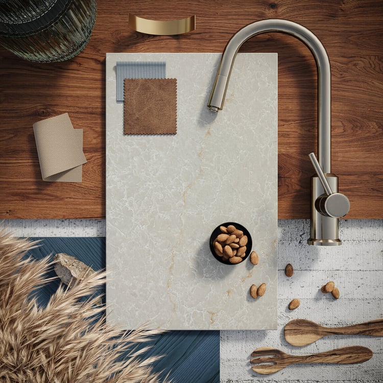 5310 Brillianza Caesarstone worktop as the base of the moodboard
Step 3: Layer in textures and secondary materials
A beautiful kitchen relies on tactile contrast to keep it from feeling clinical. To achieve this, layer in samples or images of your complementing materials. We recommend introducing warm timber accents (like oak open shelving), splashback tile variants (glossy Mediterranean-style porcelain vs. matte ceramics), and metal finishes (brushed brass, matte black, or classic polished chrome).
Step 4: Refine, scale, and test under light
Step back and evaluate your board as a whole. When creating your board, try to keep the physical items roughly in proportion to how they’ll be in the real room (e.g., your worktop and cabinetry samples should be large, while your tap and handle choices should be small accent callouts). If you’re using physical samples, look at them together in your actual kitchen space at morning, noon and night to see how natural light alters the colours.
Beware of the "Pinterest Trap"
When creating a digital board, it’s incredibly easy to accidentally combine three completely different kitchen styles. You might pin a rustic-farmhouse ceiling beam, an ultra-modern minimalist concrete island, and traditional glamorous brass handles.
Individually, those elements are beautiful. Together, they can create visual chaos. If you find your board pulling in multiple directions, force yourself to create two separate "mini-boards" (e.g., Option A: Modern Industrial vs. Option B: Soft Organic Shaker). Compare them side-by-side, pick one path, and delete the other.
Digital vs. physical: which should you choose?
- Digital mood boards: Exceptional for the early brainstorming phase and ideal for easily sharing (or collaborating) with your partner. Platforms like Pinterest are perfect for saving broad layout ideas, lighting fixtures, and overall stylistic directions (such as Shaker elegance or industrial minimalism).
- Physical mood boards: Vital for the final decision-making phase and ideal for having in your home so you walk past it every day. You can’t feel the texture of a premium worktop or see how a cabinet paint sample actually reflects light on a screen.
Pro tip: Combine both approaches. Use a digital board to find your design direction, then order physical swatches, including paint cards, timber blocks, and worktop samples, to create a tactile physical board before signing off on your kitchen order.
Key elements to include on your kitchen board
To make your mood board functional for your designer or builder, make sure it includes a balance of the following attributes:
|
Element category |
What to include |
Purpose |
|
Primary surfaces |
Worktop samples, cabinet door swatches |
Sets the core colour palette and undertone (warm vs. cool) |
|
Secondary surfaces |
Flooring planks, splashback tiles, wall paint cards |
Establishes the backdrop and vertical-to-horizontal transitions |
|
Hardware & metals |
Knobs, cup pulls, tap finishes (e.g., brushed brass) |
Acts as the "jewellery" of the room, adding contrast and cohesion |
|
Soft textures |
Bar stool fabrics, window blinds, open-shelf decor images |
Softens the hard surfaces and prevents a clinical feel |
How to test your board against kitchen lighting
Kitchens require a mix of task, ambient, and accent lighting. Before you finalise your mood board materials, pass them through this quick diagnostic checklist:
- North-facing kitchens: These rooms receive a cool, slightly blue-toned natural light. Cool grey worktops or stark white paint can look clinical here. Use your mood board to introduce warmer undertones, like creamy whites, warm oaks, or surfaces with soft gold veining.
- South-facing kitchens: These spaces are flooded with warm, golden light all day long. This can make warm yellows or beige tones look overly saturated. Cooler tones and crisp whites balance this beautifully.
- The different lighting test: Make sure you view your physical mood board under your planned LED under-cabinet task lighting – and be mindful that low-quality bulbs can cast a greenish hue over beautiful worktops and paint.
Bring your vision to life in a Caesarstone showroom
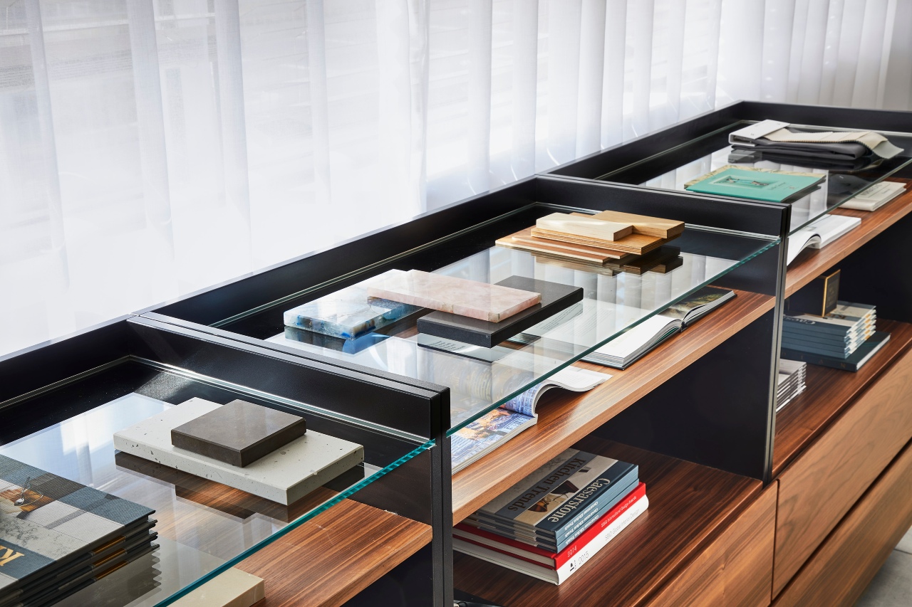
While collecting samples at home is essential, there is no better place to see your ideas or fine-tune your project than a dedicated Caesarstone showroom.
Our studios act as the ultimate physical mood board studio. Instead of relying on samples, you can view large-format surface slabs alongside extensive libraries of paint cards, fabric swatches, tiles and more.
Visiting a studio allows you to:
- Compare materials in real time: Pair surface samples directly against cabinet doors, handles, and seat fabrics to instantly see how undertones work together.
- Get expert guidance: Collaborate with in-house Caesarstone design consultants who can offer professional feedback, help resolve visual clashes, and suggest complementary finishes you might not have considered.
- See full-scale movement: View large surface installations to understand how dynamic veining, grain patterns, and light reflection will feel in a full kitchen layout.
Whether you are starting from scratch with raw ideas or finalising your last few detail choices, a studio session offers the clarity needed to sign off on your design with complete confidence – book your visit today!
From mood board to reality
A mood board is only as good as the accuracy of its pieces. Printing out a picture of a white worktop will never match the security of holding the real material in your hands, testing its texture, and seeing how it resists spills.
Ready to anchor your design? Explore our range of premium, durable surfaces and order your physical samples to complete your design layout.